Did you know that nearly 70% of online shopping carts are abandoned at checkout? For Shopify merchants, this is a big chance. Optimizing the checkout can greatly boost sales and cut down on cart abandonment. Making your Shopify checkout better not only improves user experience but also makes the sales process smoother. This is key to increasing your store’s earnings.
Optimizing Shopify checkout makes the final steps of buying easier and more straightforward. This makes it less frustrating for customers and helps increase sales. By working on your Shopify checkout, you’re setting your store up for success and happy customers.
Key Takeaways
- Checkout optimization can significantly reduce cart abandonment and increase shopify sales.
- Streamlined checkout process enhances user experience and overall satisfaction.
- Identifying and fixing pain points is essential to improve shopify checkout process.
- Implementing user-friendly design and fast load speeds is critical for success.
- Offering multiple payment options makes buying easier and more convenient.
Understanding the Importance of Checkout Optimization in Shopify
In the world of online shopping, getting shopify checkout optimization right is key. A smooth checkout process makes customers happy and helps increase sales. Following Shopify checkout best practices leads to more sales and higher revenue.
Why Checkout Page Matters
The checkout page is where customers decide to buy. A hard-to-use checkout can lead to lost sales. By optimizing checkout, you help customers buy easily, boosting sales. A good checkout page also builds trust, making transactions smooth and secure.
Common Checkout Issues in Shopify
Shopify checkout can face several problems. These include hard navigation, long forms, and few payment options. To fix these, follow Shopify checkout best practices. Simplify steps, reduce forms, and add more payment choices. Solving these issues boosts sales and improves the shopping experience.
Identifying Pain Points in Your Current Checkout Process
Improving your Shopify online store starts with finding issues in your checkout process. Knowing where customers struggle helps you make the checkout smoother. This can lead to more sales.
User Feedback and Analytics
Listening to what your customers say is key. Ask them about their checkout experience. They might point out problems you haven’t noticed before. Also, analytics tools can show where people leave your site during checkout.
Conversion Rate Drop-off Points
Figuring out why people leave their carts is important. Look at your conversion funnel to find out where people stop. By fixing these issues, you can make your checkout easier and keep more customers.
| Checkout Stage | Common Issues | Solutions |
|---|---|---|
| Cart Review | Hidden Costs | Provide transparent pricing |
| Shipping Information | Confusing input fields | Simplify form design |
| Payment Process | Limited payment options | Add multiple payment gateways |
Making the Checkout Process User-Friendly
Creating a user-friendly checkout design boosts customer happiness and sales. Start by cutting down the number of steps. This makes buying easier and faster, leading to more sales and a better Shopify user experience.
Using auto-fill technology is key for a smooth checkout. It lets customers quickly enter their details, saving time and reducing cart abandonment. This feature makes the checkout process smooth and fun for your customers.

Clear progress indicators are also important. They show customers how close they are to finishing their purchase. This reduces cart abandonment and makes the process clearer and more satisfying.
To make your checkout page even better, make it look good and easy to use. Use simple fonts, colors, and instructions. This helps avoid confusion and makes the experience better for users.
By adding these features to your checkout, you create a friendly environment for quick and successful sales. A clear and efficient checkout process leads to happy customers and more sales.
Implementing a Clean and Simple Design
Improving the checkout process is key to a better user experience. A clean design helps by reducing distractions and guiding customers to complete their purchase. This makes the checkout smoother and more efficient.
Minimalistic Layout
A minimalistic layout means fewer elements on the checkout page. This reduces clutter and lets customers focus on their purchase. To make your Shopify checkout simple, consider these tips:
- Limit the number of form fields
- Use plenty of white space
- Choose a clear, easy-to-read font
Clear Call-to-Actions
Clear call-to-actions (CTAs) are essential for guiding users through checkout. They should be easy to spot, with contrasting colors. To improve your Shopify checkout, ensure each button clearly states what it does, like “Continue to Payment” or “Place Order”. Keeping the language and placement of these buttons consistent helps avoid confusion and improves the user experience.
Optimize Shopify Checkout Page Load Speed
Speeding up your Shopify checkout page is key to keeping customers and boosting sales. A slow page can cause people to leave without buying, leading to frustration and a bad experience.
Here are some ways to improve Shopify checkout load speed and give a quick Shopify checkout experience:
- Optimize Images: Make sure all images are small and compressed to speed up loading.
- Reduce Unnecessary Scripts: Get rid of scripts that aren’t needed for checkout. This makes things faster and more efficient.
- Faster Hosting Solutions: Pick a hosting that loads quickly. This can make your checkout much faster and more efficient Shopify checkout.
By using these methods, you can make your checkout smooth and quick. This will make customers happier and more likely to buy.
| Optimization Method | Action | Impact on Load Speed |
|---|---|---|
| Image Optimization | Compress and resize images | High |
| Script Reduction | Remove non-essential scripts | Medium |
| Hosting Solutions | Upgrade to faster hosting | High |
Using One-Page Checkout for Faster Transactions
The one-page checkout model is changing online shopping. It makes buying things faster by cutting down on steps. Using this model can make your Shopify checkout smoother, leading to more sales.
Benefits of One-Page Checkout
One-page checkout is good for both sellers and buyers. Here’s why:
- Reduced Cart Abandonment: It makes buying easier, so people are less likely to leave without buying.
- Faster Transactions: It speeds up buying, making shopping better for everyone.
- Enhanced User Experience: It’s easy to use, keeping customers happy and more likely to buy.

Case Studies and Success Stories
Many stores have seen big improvements by using one-page checkout. For example:
“After switching to a one-page checkout, Shopify store XYZ saw a 22% increase in conversion rates and a 15% reduction in cart abandonment.”
Another store had great results too:
“Brand ABC streamlined their Shopify checkout process and observed a remarkable boost in efficiency, achieving a shorter checkout time and higher customer retention.”
These stories show how one-page checkout can change your online store. It makes shopping faster and more fun for your customers.
| Retailer | Improvement |
|---|---|
| XYZ | 22% increase in conversion rates |
| ABC | 15% reduction in cart abandonment |
Offering Multiple Payment Options
Adding various payment gateways to your Shopify store can really help. It makes shopping easier for everyone. This way, your store becomes more flexible and convenient for customers.
Popular Payment Gateways
Using well-known payment gateways in your Shopify store attracts more customers. Some top choices include:
- PayPal
- Stripe
- Square
- Amazon Pay
- Apple Pay
These gateways are trusted worldwide and work well with Shopify. They make transactions smooth and boost customer trust. For tips on running flash sales, see this guide.
Seamless Payment Experience
Keeping payments easy is key to keeping customers. A smooth checkout process can make customers happier. Using many payment gateways means you can accept different types of payments.
A clean design and clear checkout process are essential. They make shopping better and build trust in your brand.
In short, using many payment gateways and focusing on flexibility can meet customer needs. It can also increase sales and keep customers coming back.
| Payment Gateway | Key Features |
|---|---|
| PayPal | Wide acceptance, strong buyer protection |
| Stripe | Easy integration, supports multiple currencies |
| Square | Simple setup, in-person payments |
| Amazon Pay | Familiar to customers, seamless checkout experience |
| Apple Pay | Touch ID for security, fast transactions |
Adding Trust Badges and Security Features
Adding Shopify trust badges and checkout security features to your store can really help. It makes customers feel more confident and can lead to more sales. They want to know their info is safe when they shop online.
Show Shopify checkout trust signs like SSL certificates and secure payment logos. Also, money-back guarantees are great to show. These signs make customers feel safe and more likely to buy.
Security features like two-factor authentication and SSL encryption keep your store safe. Regular security checks also help protect customer info. These steps make your store a secure place for customers to shop.
Trust Badge Placement Tips:
- Put SSL badges where everyone can see them on the checkout page.
- Show secure payment provider logos next to where customers pay.
- Put money-back guarantees or customer satisfaction badges after they pay.
By using Shopify trust badges and strong checkout security features, you meet industry standards. You also keep your customers’ data safe. This makes your store look good and helps you sell more.
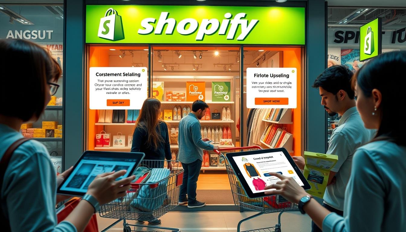
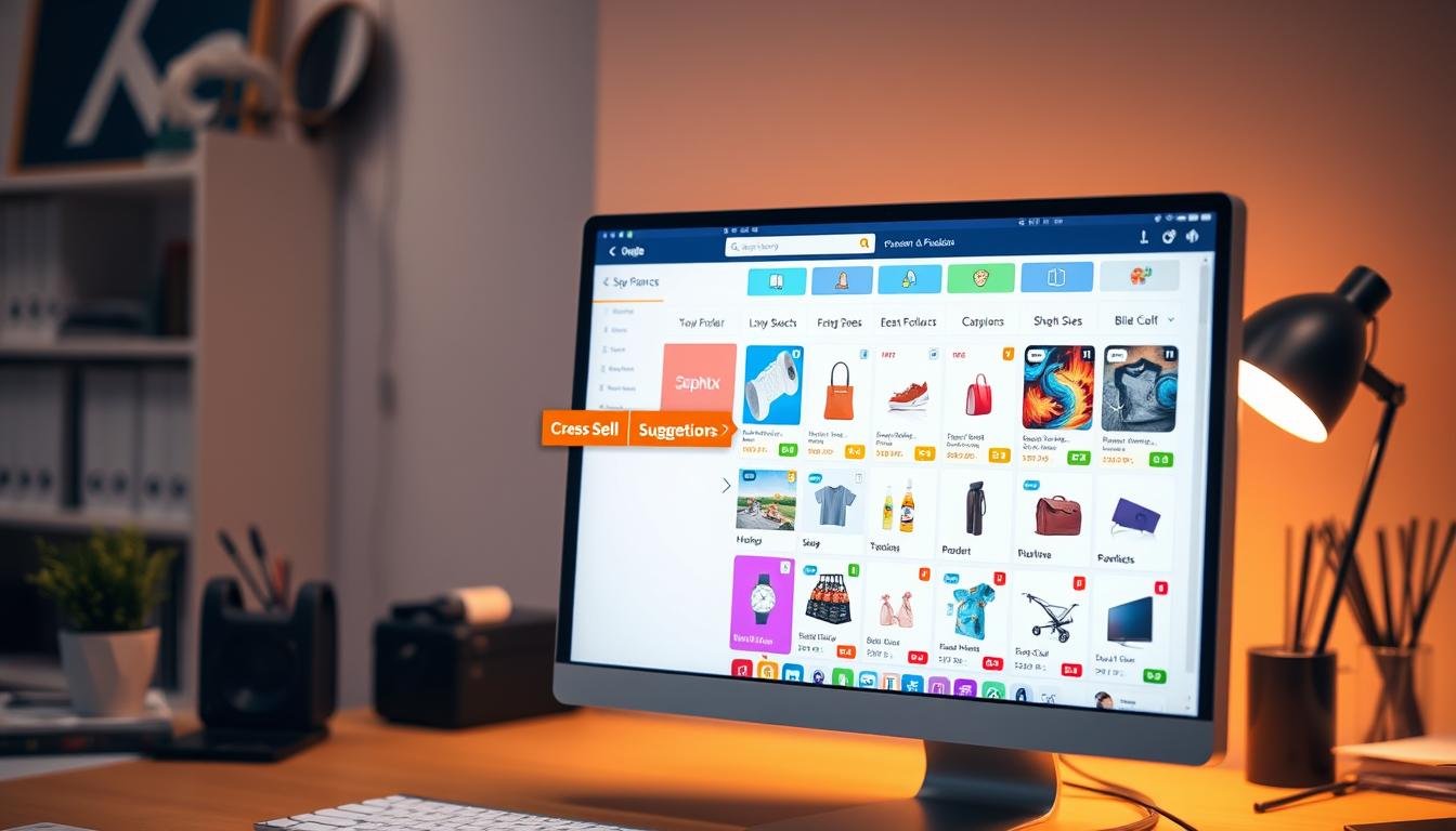
Utilizing Upsell and Cross-Sell Strategies
Upsell and cross-sell strategies can greatly boost your Shopify store’s average order value. By showing customers related products or upgrades, you can use psychological triggers to increase sales. Here are some top Shopify apps and the benefits of these strategies.
Recommended Shopify Apps
Choosing the right tools makes it easier to use these strategies:
- Bold Upsell: This app allows you to offer related items on product and checkout pages, boosting upsell chances.
- One Click Upsell: It integrates smoothly, enabling post-purchase upsell offers. This way, you can increase average order value without annoying customers.
- MVR Free Shipping Bar & Upsell: It encourages customers to spend more by giving free shipping and a smart checkout cross-sell tactic.
Benefits of Upselling
Upselling offers big benefits for your online store:
- Higher Revenue: Upselling means more money from each customer, raising your average order value.
- Enhanced Customer Experience: Relevant products make shopping better, making customers feel appreciated and understood.
- Inventory Management: Upsell and cross-sell tactics help manage stock levels, reducing waste.
By using these apps wisely and understanding their benefits, your Shopify store can make the most of upsell and cross-sell strategies.
Providing Transparent Shipping Information and Costs
Achieving Shopify shipping transparency is key to building trust with customers and lowering cart abandonment. Showing clear shipping costs and delivery times at checkout makes the process better. Customers like knowing what they pay and when they’ll get their items.
Free Shipping Incentives
Offering free shipping can boost sales. It draws in new shoppers and gets current ones to buy more. Setting a minimum order for free shipping can raise the amount spent while keeping costs clear.
“Customers spend 30% more on orders when free shipping is part of the offer,” as reported by The Wall Street Journal.
Accurate Delivery Estimates
It’s important to give accurate delivery times at checkout. This helps manage what customers expect. Clear delivery plans can lower worries and questions. It also makes shopping better, leading to happier customers and more repeat business.
| Benefit | Description |
|---|---|
| Increased Trust | Clear shipping costs and delivery estimates boost customer confidence in their purchases. |
| Higher Sales | Free shipping incentives can significantly increase the average order value. |
| Repeat Customers | Transparent shipping practices lead to a more loyal customer base who appreciate the honesty and clarity. |
Leveraging Cart Abandonment Tools
Boosting conversions on your Shopify store is key. Using the right tools to tackle cart abandonment can help. Let’s look at two effective methods: automated email reminders and personalized offers and discounts.
Automated Email Reminders
Automated email reminders are essential for any cart abandonment strategy. They remind customers about their abandoned carts, encouraging them to finish their purchases. Many tools offer customizable email templates with product images and direct links.
Personalized Offers and Discounts
Adding personalized offers to your cart abandonment strategy can make a big difference. Offer discounts based on the items left in the cart or the customer’s browsing history. This approach makes customers feel valued, increasing the chance they’ll complete their purchase.
Conclusion
Reflecting on the journey to master Shopify checkout optimization shows each step is key. It boosts both user experience and sales. We talked about making the checkout simple and adding many payment options.
We looked at ways to cut down on cart abandonment and make checkout safer. Adding trust badges, live chat, and clear shipping info builds trust. It also makes customers more likely to buy.
Using tools like automated email reminders and upsell strategies can increase your average order value. For more tips, check out the comprehensive guide on checkout process optimization.
Remember, a smooth checkout process is essential for sales. This guide aims to help you improve your e-commerce site. Here’s to a better checkout experience and a more profitable future for your Shopify store!


